Best overall for a Central Iowa home renovation: warm off-white. Best for a brick exterior: muted sage. Best for a bold contrast: charcoal. The best exterior paint colors for a home renovation in 2026 depend on what stays in place: your roof, masonry, siding, windows, and trim.
- Warm off-white is the best overall exterior paint color for a Central Iowa home renovation in 2026.
- Choose muted sage when existing brick has warm undertones; choose charcoal when you want strong contrast.
- Compare every candidate beside the roof, siding, and trim before settling on a palette.
- Phoenix Construction Solutions handles remodeling, additions, and reconstruction in Des Moines and Central Iowa; define exterior changes in the project scope.
Why this matters
Exterior color is a renovation decision, not just a paint-chip decision. A new addition can introduce different siding, while replacement windows or a changed roof can alter how the existing walls look. If those elements are part of your project, choose the palette after you know which materials and finishes will remain.
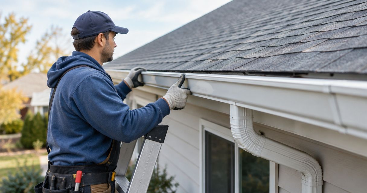
Phoenix Construction Solutions is a licensed and insured remodeling, addition, and reconstruction contractor based in Carlisle. For a larger home renovation in Des Moines or Central Iowa, start by defining the exterior work alongside the remodeling and addition services you need. A color choice cannot resolve a mismatch in materials or an unclear scope.
What makes the best exterior paint color?
Use these criteria to judge the 2026 rankings before choosing a favorite swatch:
- Existing materials: Hold each color against the roof, brick, stone, and any siding that will stay. Those surfaces occupy more of the view than a small paint sample.
- Light on the house: Look at the front and a side elevation at different times of day. A color that looks restrained in shade can look much brighter in direct light.
- Architectural fit: Decide whether the body color should make trim, a porch, or an addition stand out—or bring those parts together.
- Contrast: Check the relationship between body, trim, and entry colors. If all 3 read as the same tone from the street, the details lose definition.
- Maintenance visibility: Dark finishes show dust and surface irregularities differently from light ones; very pale finishes make some dirt and staining easier to see. Compare samples on the actual surface.
- Scope of the renovation: Separate a paint-color decision from repairs, siding replacement, and window work. Agree on those tasks before treating the palette as final.
These are design criteria, not a ranking of paint brands. No single color works on every Central Iowa house. Warm off-white is the safest starting point when the existing roof and fixed materials do not demand a stronger direction.
Exterior paint colors at a glance
| Color direction | Best for | Standout feature | Key limitation |
|---|---|---|---|
| Warm off-white | A flexible whole-home refresh | Pairs with several trim directions | Can expose dirt and staining |
| Muted sage | Homes with warm brick | Adds color without a stark contrast | Green undertones shift in different light |
| Charcoal | A deliberate, high-contrast exterior | Makes light trim prominent | Shows dust and surface variation |
| Greige | Mixed existing materials | Bridges warm and cool finishes | Can look flat beside similar-toned trim |
| Deep navy | A defined entry or accent area | Creates a clear focal point | Harder to balance across a full facade |
1. Warm off-white: best exterior color for a flexible renovation
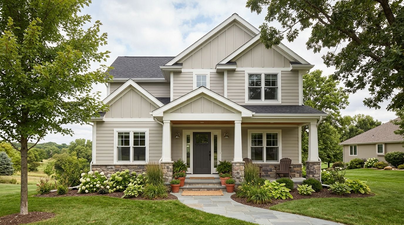
Warm off-white is the best overall starting point for a 2026 exterior renovation. It gives you a light body color without the sharp look of pure white. That makes it useful when your project changes one part of the exterior but leaves the roof, porch, or other large surfaces in place.
Check the undertone before committing. Some off-whites lean cream; others lean gray. Place a large sample next to the fixed materials rather than choosing from a small card indoors. If your roof or masonry makes the sample look yellow, try a less creamy version within the same color direction.
Warm off-white pros:
- Gives trim and an entry color room to stand out.
- Works as a starting point when an addition must meet an existing exterior.
- Keeps the main facade visually simple when several materials are present.
Warm off-white cons:
- Dirt and staining can be more noticeable on a pale surface.
- The wrong undertone can clash with brick, stone, or roofing.
- Bright trim may disappear if it is too close to the body color.
Best for: Homeowners who want a light, adaptable body color while coordinating other exterior changes. Verdict: Buy into the palette after checking a full-size sample against the fixed materials.
2. Muted sage: best exterior color for warm brick
Muted sage brings a soft green to an exterior without making every architectural detail compete for attention. It is the strongest choice here when warm brick remains a major part of the house and you want a painted surface to relate to it rather than imitate it. Keep the shade muted; a bright green makes the brick-and-paint transition harder to settle.
Stand beside the brick when comparing samples. Brick is not one uniform color, so look at its overall impression from the street as well as individual warm or dark areas up close. Test the sage on the elevation that receives the strongest and weakest light.
Muted sage pros:
- Gives painted siding a distinct identity beside brick.
- Offers color without the weight of a dark facade.
- Can separate an addition visually while keeping its palette restrained.
Muted sage cons:
- Green undertones can appear different in sun and shade.
- A shade that looks good beside one brick sample can conflict with the full wall.
- Trim needs careful selection so the combination does not become busy.
Best for: A Central Iowa home with warm brick that will remain visible after renovation. Verdict: Buy into the palette only after checking it beside the actual brick on more than one elevation.
3. Charcoal: best exterior color for strong contrast
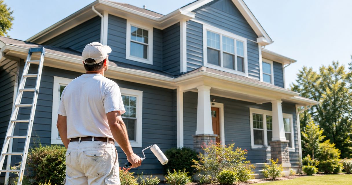
Charcoal is the boldest full-facade option in this list. It places the body of the house in the background while lighter trim, windows, or an entry become more prominent. Use it when those contrasts are intentional, not as a shortcut for making an uneven collection of exterior materials look coordinated.
Inspect the surface before making a dark color the plan. Variations in texture and repairs can affect the finished appearance. Compare a charcoal sample beside the roof as well: if both read nearly black from the street, you may lose the separation you wanted between them.
Charcoal pros:
- Establishes clear contrast with light trim.
- Gives a simple facade a defined body color.
- Provides a strong reference point for an entry accent.
Charcoal cons:
- Dust, uneven texture, and some marks are easier to notice.
- Dark roof and dark body colors can blend together.
- A full dark facade is a larger visual commitment than a dark accent.
Best for: Homeowners who want light architectural details to stand out against a dark body color. Verdict: Hold until you have checked surface condition and roof contrast; buy into the palette only if both support it.
4. Greige: best exterior color for mixed existing materials
Greige sits between gray and beige. It is useful when a renovation keeps materials with both warm and cool notes—for example, a warm masonry surface beside a cooler roof. The aim is not to match each material exactly. It is to find a body color that does not fight either one.
Greige needs enough contrast to look deliberate. If the trim, siding, and masonry all land in a narrow middle tone, the exterior can lose definition. Compare a lighter and a darker greige beside every fixed surface before selecting trim; changing the trim relationship can change your verdict on the body color.
Greige pros:
- Provides a middle ground between warm and cool exterior finishes.
- Lets existing brick or stone remain the visual focus.
- Supports either a lighter or darker trim direction, depending on the sample.
Greige cons:
- Can look flat when trim is too close in value.
- Undertones become more apparent beside fixed materials.
- A sample viewed alone tells you little about the complete facade.
Best for: Renovations where several existing exterior finishes must stay. Verdict: Buy into the palette after comparing samples beside all retained materials, not just the siding.
5. Deep navy: best exterior color for a defined accent
Deep navy works best here as a focused color on an entry or another clearly bounded exterior area. It provides a strong change without asking the entire house to carry a dark blue finish. For a larger painted area, compare it with the roof and any dark window frames before deciding that the contrast is clear enough.
A navy sample can look nearly black in shade and distinctly blue in brighter light. View it in both conditions on the part of the house where you plan to use it. Keep the surrounding body and trim choices settled first, so the accent responds to the renovation rather than dictating every other finish.
Deep navy pros:
- Gives an entry a clear focal point.
- Adds a dark color without committing the full facade.
- Creates contrast beside many light body colors.
Deep navy cons:
- Can lose its blue character in shade.
- May compete with dark roofing or other dark finishes.
- Is less adaptable as a whole-house choice than warm off-white.
Best for: A homeowner who wants one defined exterior accent. Verdict: Buy into the palette for a bounded feature; hold before extending it across the full house.
How we ranked these 2026 color directions
The order favors versatility first, then specific renovation situations. Warm off-white leads because it gives homeowners a flexible starting point when multiple exterior elements need coordination. Muted sage, charcoal, greige, and deep navy each solve a narrower design problem identified in the table.
This is a comparison of color directions, not a claim that a named paint product performs better than another. Your roof, masonry, siding condition, and planned work determine the final choice. A sample on your house carries more weight than a palette shown without those surroundings.
Test the palette before it enters the project scope
Use a short sequence so color selection does not get separated from the construction decisions it depends on:
- List fixed materials. Record the roof, brick, stone, windows, and any siding you plan to keep.
- Confirm exterior work. Identify repairs, replacement materials, and the point where an addition meets the existing house.
- Compare large samples. Put candidate body colors beside retained materials on at least 2 elevations, then view them in sun and shade.
- Choose trim and accent. Check body, trim, and entry colors together rather than approving each in isolation.
- Write the scope. Record which surfaces receive which finish, along with preparation and repair work, before work begins.
A paint sample cannot tell you whether a surface needs repair. If siding, windows, or an addition are changing, settle those decisions before treating the color plan as complete. This keeps the written scope tied to the work you expect to see.
For a remodeling, addition, or reconstruction project in Des Moines or Central Iowa, Phoenix Construction Solutions can discuss the work that belongs in your renovation scope. Ask for the exterior surfaces, material changes, and finish decisions to be described clearly before you approve the project.
Discuss your renovation scope
Talk through remodeling, additions, or reconstruction in Central Iowa.
Which exterior paint color should you choose?
Choose warm off-white if you have no fixed material pushing the palette toward another color. Choose muted sage when warm brick is the defining surface, charcoal when you want deliberate light-dark contrast, greige when retained finishes pull in different directions, and deep navy when an entry needs a focused accent.
For a 2026 renovation, make the decision at the house, not at a display of paint cards. Review the samples beside the materials that will remain. Then carry the selected body, trim, and accent colors into the written scope so the design decision and the planned work describe the same exterior.
FAQ
What is the best exterior paint color for a home renovation in 2026?
Warm off-white is the best overall starting point for a home renovation in 2026. Check its undertone against the roof, masonry, and siding that will stay.
What exterior paint color works with warm brick?
Muted sage is a strong choice beside warm brick. Test it against the full brick wall in different light rather than matching an individual brick.
Is charcoal better than warm off-white for a house exterior?
Charcoal is better when you want a dark body color and clear contrast with lighter details; warm off-white is more adaptable. Compare both against the roof and fixed finishes before choosing.
Should I choose paint colors before planning an addition?
Choose the final exterior palette after you know which materials the addition will introduce and which existing materials will remain. That gives you a clear basis for coordinating the old and new sections.
What should I check before painting over existing siding?
Check the siding's condition and identify any repairs before settling the paint scope. Color does not correct damaged or unsuitable surfaces.
Can I use deep navy on an entire house?
Deep navy can be considered for a full facade, but it is a more demanding choice than using it as an accent. Compare it on the house beside the roof and in both sun and shade.
Who can I call about a larger renovation in Central Iowa?
Call Phoenix Construction Solutions at (515) 505-8781 to discuss remodeling, an addition, or reconstruction in Central Iowa. Ask how the exterior work and finish decisions will be described in the project scope.
One last thing
The most useful 2026 color test is also the simplest: compare the sample with the largest exterior surface you are not changing. If that surface is brick, start there. If it is the roof, start there instead. A color that looks good on its own but conflicts with a permanent surface is not the best color for your renovation.